
Working with Charts
Charts help turn data into visuals that are easier to read and compare. OfficeDocs supports charts in documents, spreadsheets, and presentations, with tools for inserting charts, editing data, changing chart types, and formatting chart elements.
Inserting a chart
You can add charts in different ways depending on the editor you are using. In documents and presentations, you usually insert a chart first and then edit its sample data. In spreadsheets, charts are typically created from selected cell data.
In documents and presentations
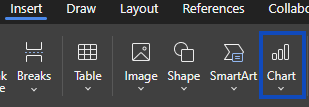
- Place the cursor where you want the chart to appear.
- Open the Insert tab.
- Click Chart.
- Choose the chart type you want to use.
- A sample chart is inserted.
- Edit the sample data to match your own information.
In spreadsheets
- Select the data range you want to use.
- Open the Insert tab.
- Click Chart.
- Choose the chart type you want to create.
- The chart is generated from the selected data range.
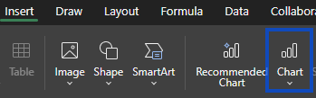
Chart types
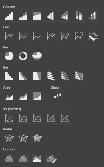
OfficeDocs supports several common chart categories. The main chart groups currently documented include Column, Line, Pie, Bar, Area, Stock, XY (Scatter), Radar, and Combo charts. Some chart styles and subtypes depend on the editor and the selected chart.
Column and bar charts
Use these chart types to compare values across categories.
- Clustered Column shows separate values side by side
- Stacked Column shows how values contribute to a total
- 100% Stacked Column compares percentage distribution
- Bar charts display the same type of comparison horizontally
Line charts
Use line charts to show change over time or across ordered categories.
- Line charts show overall trends
- Line with markers makes each data point easier to identify
- Line and scatter charts may also support lines and markers options depending on the editor and chart settings
Pie and doughnut charts
Use these charts to show how each part contributes to a whole.
- Pie charts show proportions
- Doughnut charts display similar data in a ring layout
- Pie charts do not use axes or gridlines
Area, scatter, and other charts
Other chart types are useful for more specific data patterns.
- Area charts emphasize volume or magnitude over time
- Scatter (XY) charts show relationships between values
- Stock, Radar, and Combo charts are also supported in current documentation
Editing chart data
Once a chart is inserted, you can update the data used to build it. The editing method depends on the editor.
In documents and presentations
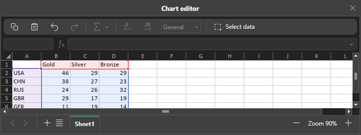
- Double-click the chart or use Edit Data.
- Update the values in the chart data editor.
- Add or adjust rows and columns as needed.
- Close the editor when your changes are complete.
In spreadsheets
- Click the chart to select it.
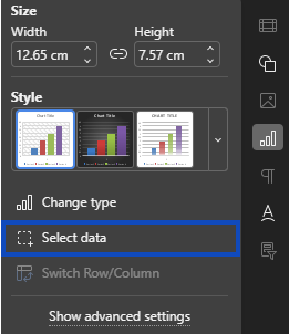
- Open the chart data options, such as Select Data on the sidepanel.
-
- Adjust the source data range if needed.
- The chart updates based on the new selection.
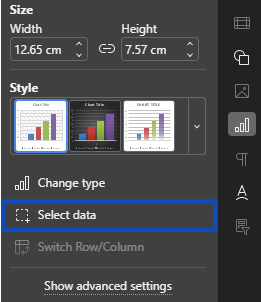
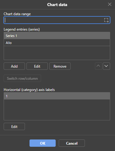
Chart elements
You can show, hide, or format key chart elements to make the chart easier to understand. There is support for elements such as Chart title, Legend, and Data labels, while additional options like axis titles and gridlines depend on the editor and chart type.
- Chart title adds a main heading
- Legend identifies data series
- Data labels show values directly on the chart
- Axis titles help describe chart axes when applicable
- Gridlines can make values easier to read
- Some chart types, such as pie charts, do not use axes or gridlines
Formatting charts
You can customize the overall appearance of a chart using chart design and formatting tools. There is options for changing chart type, applying preset chart designs, editing colors, and formatting individual chart elements on the sidepanel.
Chart styles
- Select the chart.
- Open the Chart Design tab, if available.
- Choose a predefined design or style for the chart.
Color schemes
- Select the chart.
- Open the available color or chart design options.
- Choose a color palette that fits your document or presentation.
Individual elements
You can also format specific parts of a chart, such as the title, legend, plot area, data series, axes, or labels.
- Click the chart element you want to change
- Open its formatting options
- Adjust properties such as fill, line, text, or label formatting as available
Resizing and moving charts
Charts can be resized and moved after insertion. In presentations, charts can be dragged and resized manually, or positioned more precisely through the settings panel or advanced settings. Similar resizing and positioning controls are also documented for charts in other editors.
- Click the chart to select it
- Drag the corner or side handles to resize it
- Drag the chart to move it
- Use advanced settings or the sidebar when exact size or position is needed
Chart tips
These simple practices help make charts clearer for clients and end users.
- Choose the chart type that best matches the data
- Keep the chart focused on the most important information
- Use clear titles and labels
- Apply colors consistently
- Avoid unnecessary visual effects if they make the chart harder to read